Coordinates
0 ContainersFiles in Coordinates
Order by


Andy Pope's Excel Charts
Short Description:
Submitted By:
Last Modified
16 Sep 2009
Downloads:
102
Rating:

Circle through three points.xls
Short Description:
Let the three given points be a, b, c. Use ax and ay to represent the x and y coordinates of a, and so on. The coordinates of the center p=(px,py...
Submitted By:
Last Modified
30 Aug 2007
Downloads:
319
Rating:


Equilibrium of three forces in a plane.xls
Short Description:
Purpose of calculation:
A force of known value F1 is in equilibrium with two other forces of unknown magnitude (F2 & F3).
...
Submitted By:
Last Modified
24 Sep 2008
Downloads:
199
Rating:

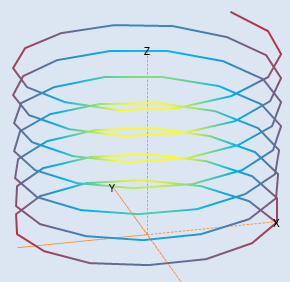
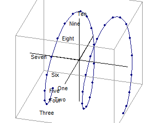
Experiments with Parametric Sketches using XY Charts
Short Description:
Submitted By:
Last Modified
06 Jul 2009
Downloads:
78
Rating:

intersect_circle_line.xls
Short Description:
Purpose of calculation: Find points of intersection between a straight line and a circle. Note #NUM! error if there is no intersection...
Submitted By:
Last Modified
07 Jun 2010
Downloads:
41
Rating:

Line between two point and perpendicular distance to third point.xls
Short Description:
Purpose of calculation:
a) Find the equation of a line through two points.
b) Calculate the shortest dist...
Submitted By:
Last Modified
22 Aug 2008
Downloads:
197
Rating:

Line intersecting circle.xls
Short Description:
Purpose of calculation Find intersection between a line and a circle with centre at origin.
Calculation Reference Geometry for Enjoy...
Submitted By:
Last Modified
26 Jul 2011
Downloads:
34
Rating:

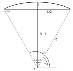
radius of curvature
Short Description:
Submitted By:
Last Modified
30 Nov 2011
Downloads:
68
Rating:

